ASN Banking App Redesign
Personal mobile banking reimagined as a trusted, seemless experience - a case study.
Client
Personal ProjectYear
2020Responsibilities
App Review & UI Design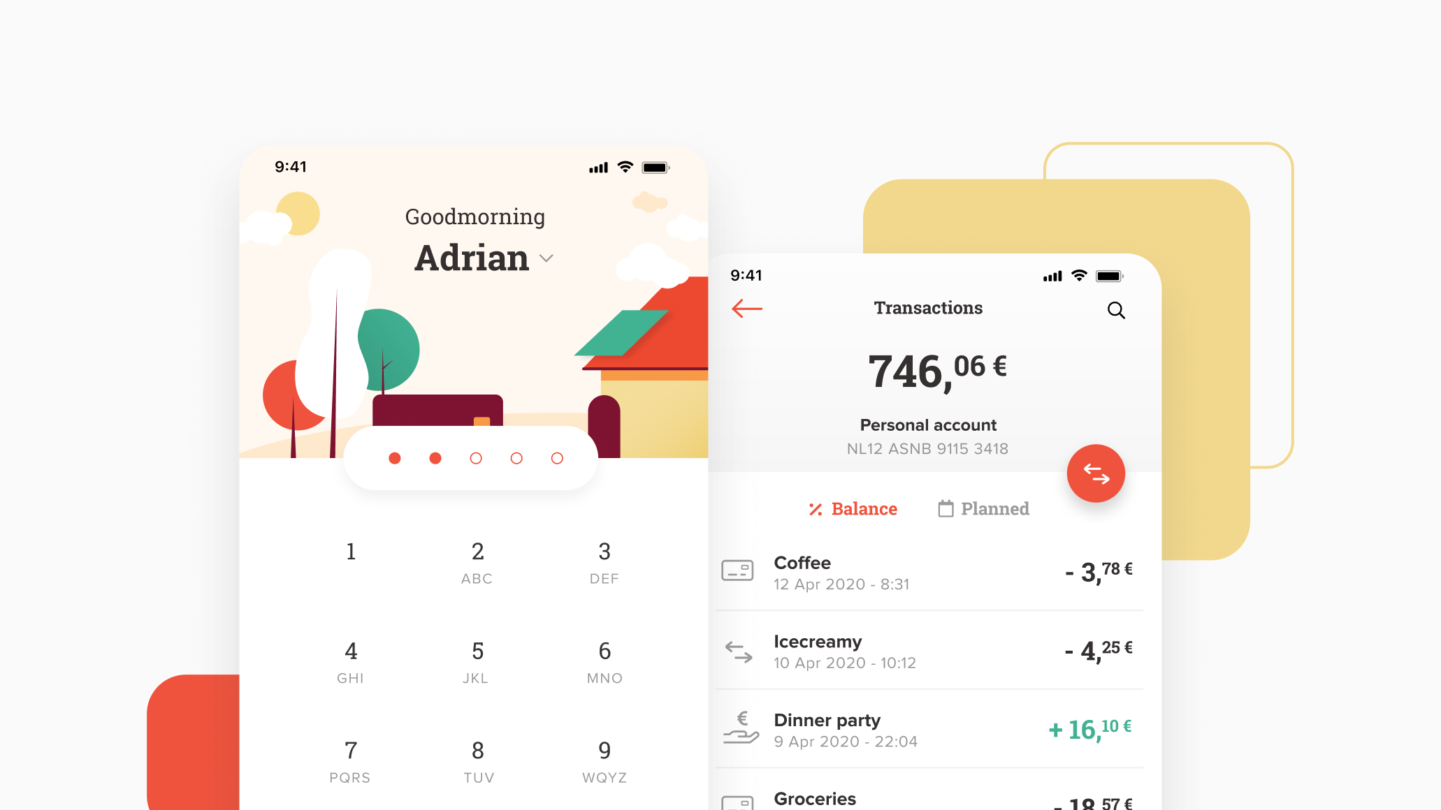
ASN is a consumer bank with a mission to foster environmental and social sustainability. Their strong sustainable values set it apart as a responsible and human way of banking. In 2016, ASN redesigned their website to embody these values with a modern, spacious layout and a personal tone of voice. However, in the last 4 years the mobile application has not been changed for the better. Therefore, as a loyal user of the mobile app, I used it as a case study to reimage the ASN mobile banking experience.
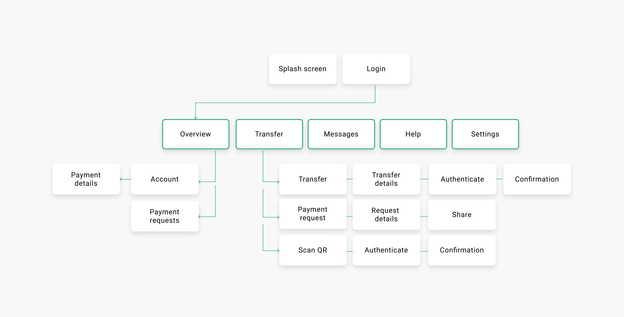
Userflow
I started with an analysis of how frequent user tasks are executed with the current mobile app. To scope the analysis, I focussed on (1) making a payment, (2) requesting a payment and (3) viewing account and transaction details. Based on the navigation structure and information hierarchy, I have identified three main opportunities for improvement:
- Payment requests have a fragmented userflow. It is divided between "Overview" and "Transfer" and only accessible through secondary navigation.
- The Transfer page behaves differently from all other menu items. It requires an extra secondary choice of the type of transfer that unnecessarily complicates one of the most used tasks.
- Although ASN puts a high value on personal communication, there is no personalized area in the app. A profile area would also be useful to group options like settings, and messages and offer personalized content.
User Interface
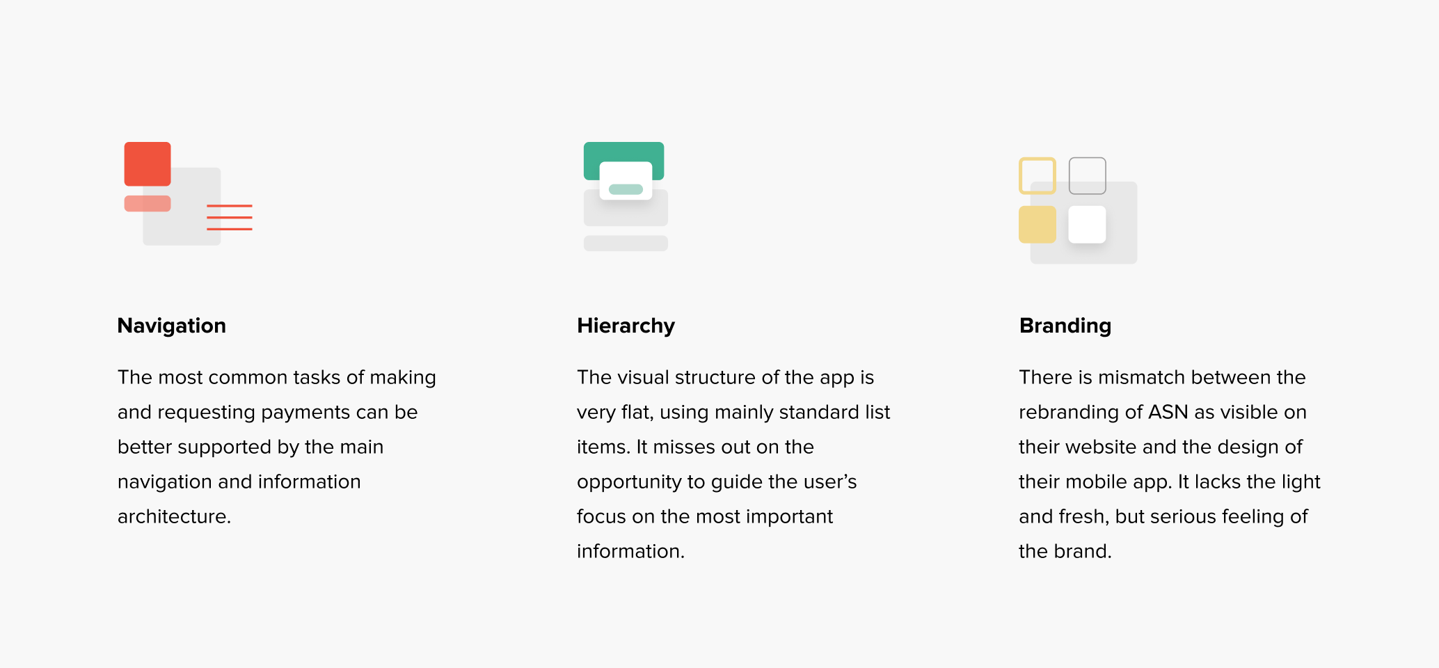
A review of the user interface screens revealed that some simple improvements could help users to better find what they are looking for, prevent mistakes and grow confidence in the mobile banking experience.

Improvement opportunities
A thorough review of the user flow and user interface revealed improvement opportunities that can be summarized in the following three themes.
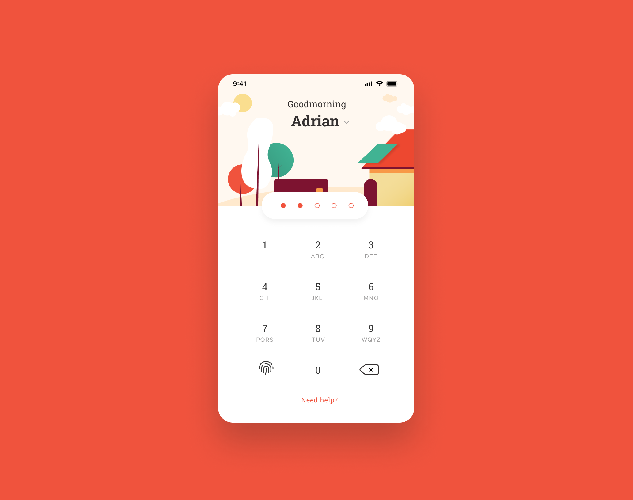
Sign in with clarity and confidence
The login screen now features a light background with more space for the keypad and clearly labeled functions to view balance and get help. Accounts are made personal with names and profile pictures and "Eppo" the squirrel features on top as the trusted brand mark, so you always know you are in the right place.
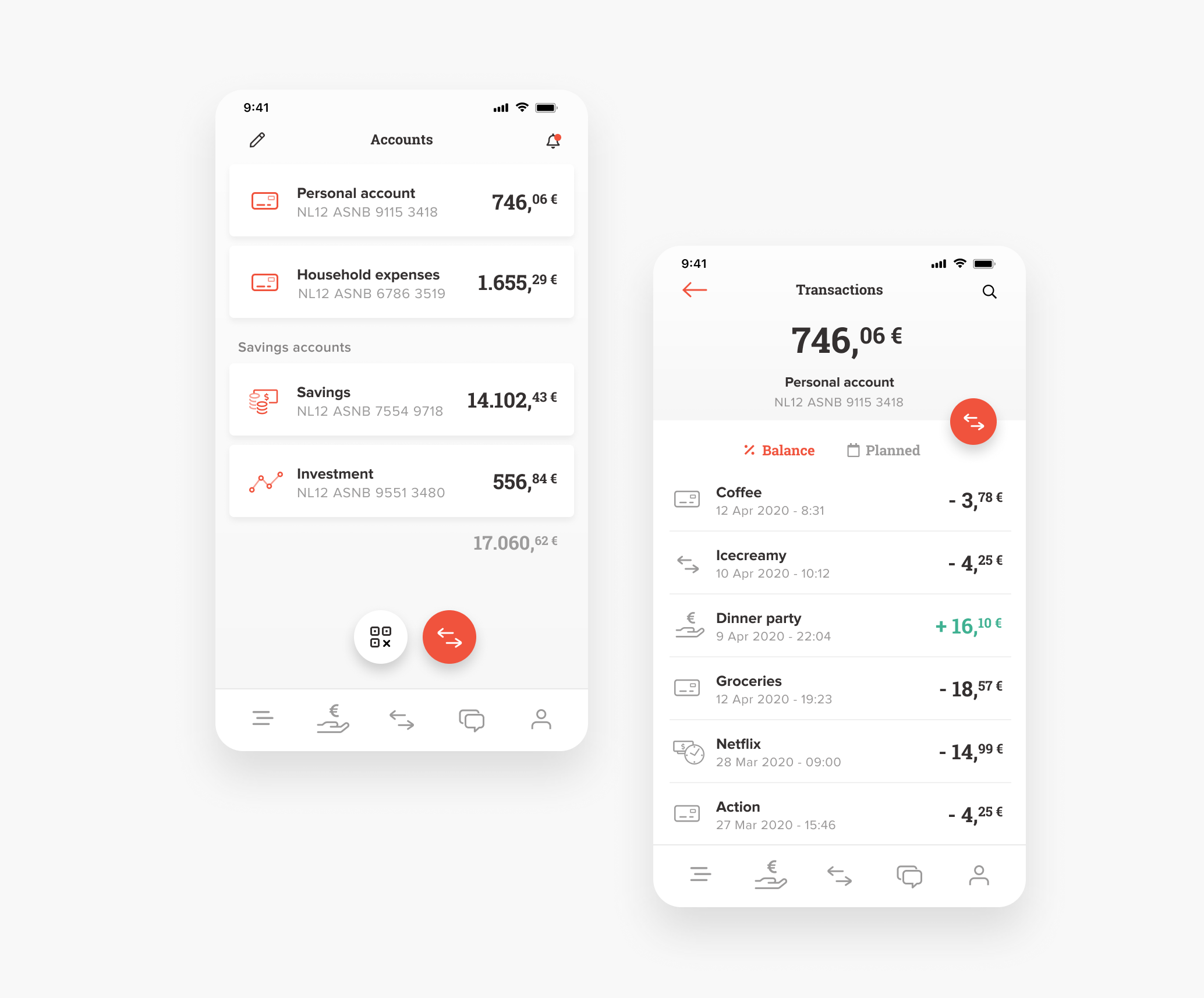
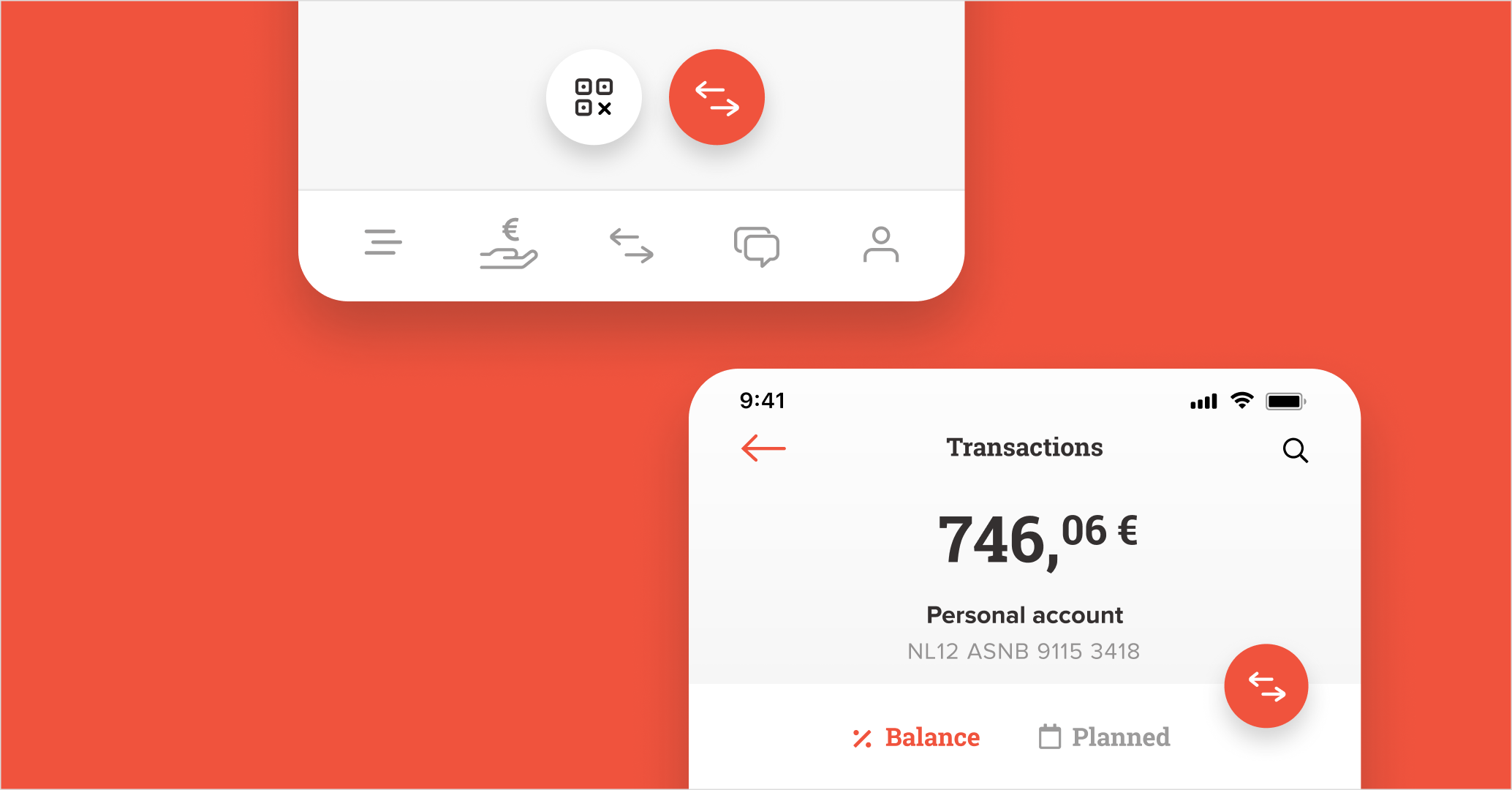
Accounts at a glance and quickly make a payment
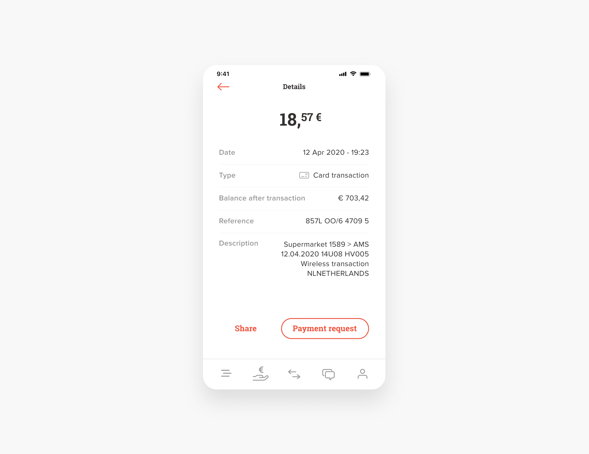
Accounts are more legible with increased spacing and a strong display of the current balance. Pay via transfer or with a QR-code are prominent options in two floating action buttons that are within easy reach. The account details show a clear hierarchy and repeats the strong action button to transfer funds. The transaction list now puts emphasis on the name and amount instead of the icons and only the negative transactions.
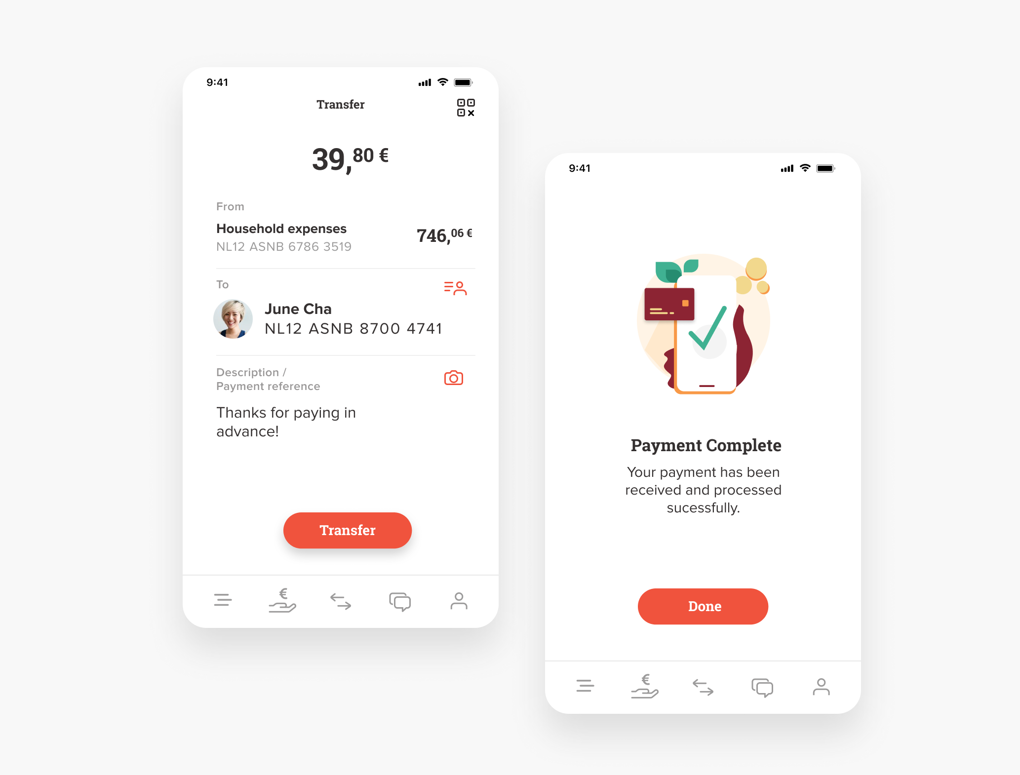
Prevent mistakes in transactions
The amount is highlighted on top and not buried somewhere in the list of details you need to fill out of a transaction. Instead of nervously triple checking the account number, a profile picture could give extra reassurance that your money ends up where you want.
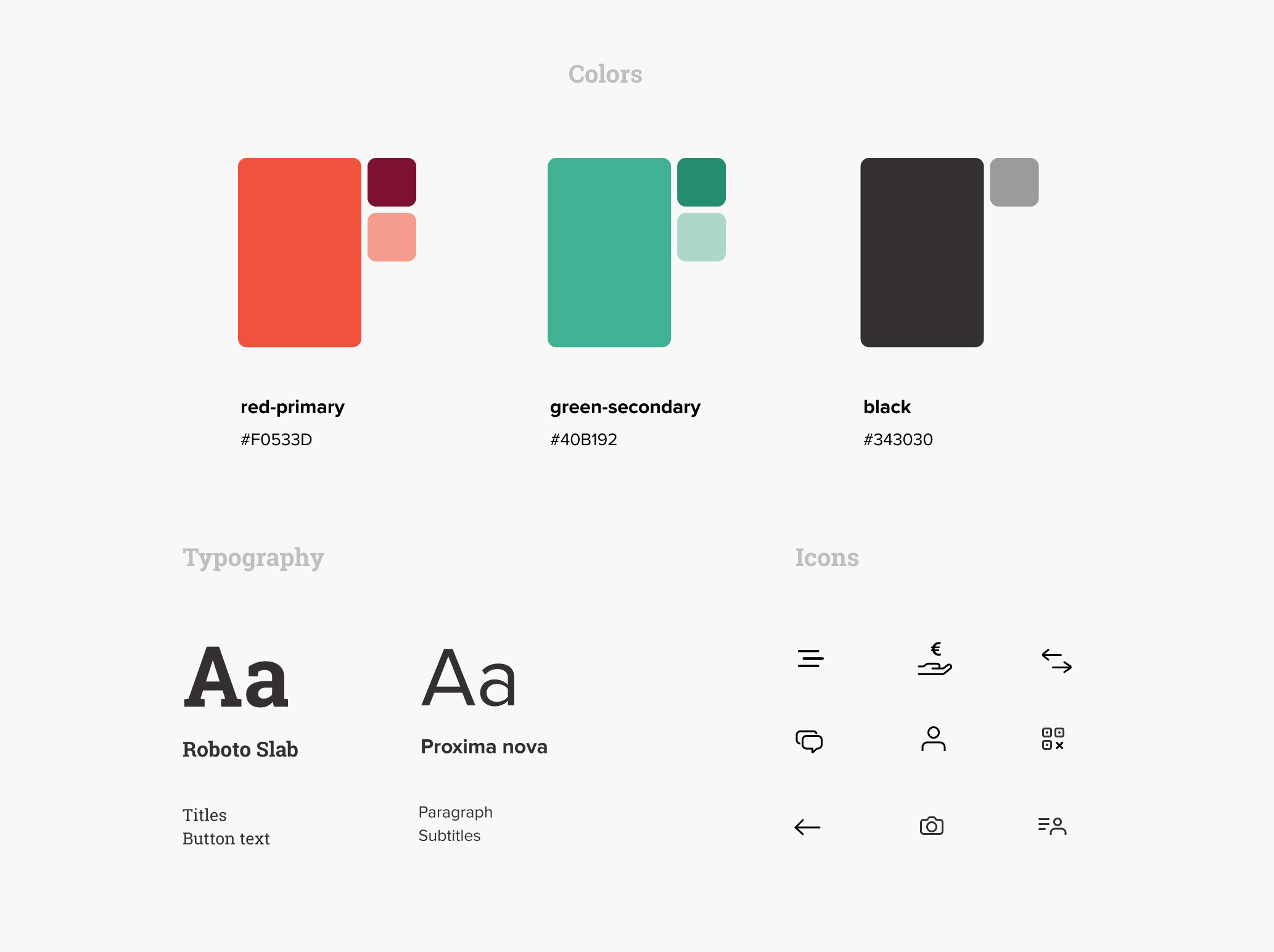
Branding
The most visible decision was to use red as a primary color instead of the current green. Red is visually stronger and also the primary color on the rebranded website of ASN. An additional benefit is that is better distinguishes ASN from other banking apps that also use green as primary color like ABN Ambro and Kendu. Colors and typography are copied from the website branding and a new icon set completes the visual style.
Conclusion
To be honest, it does not take much to better connect the mobile experience with both the users and the ASN brand. The ingredients are already there and hopefully this case study shows how they can be combined to create a memorable user experience.